
Brand Identity Redesign
Power & Lighting Systems, Inc., required a modernized identity that honored its technical legacy in lighting science while elevating its market presence. The challenge was to evolve the brand without disconnecting it from its roots in photometric measurement.
Concept
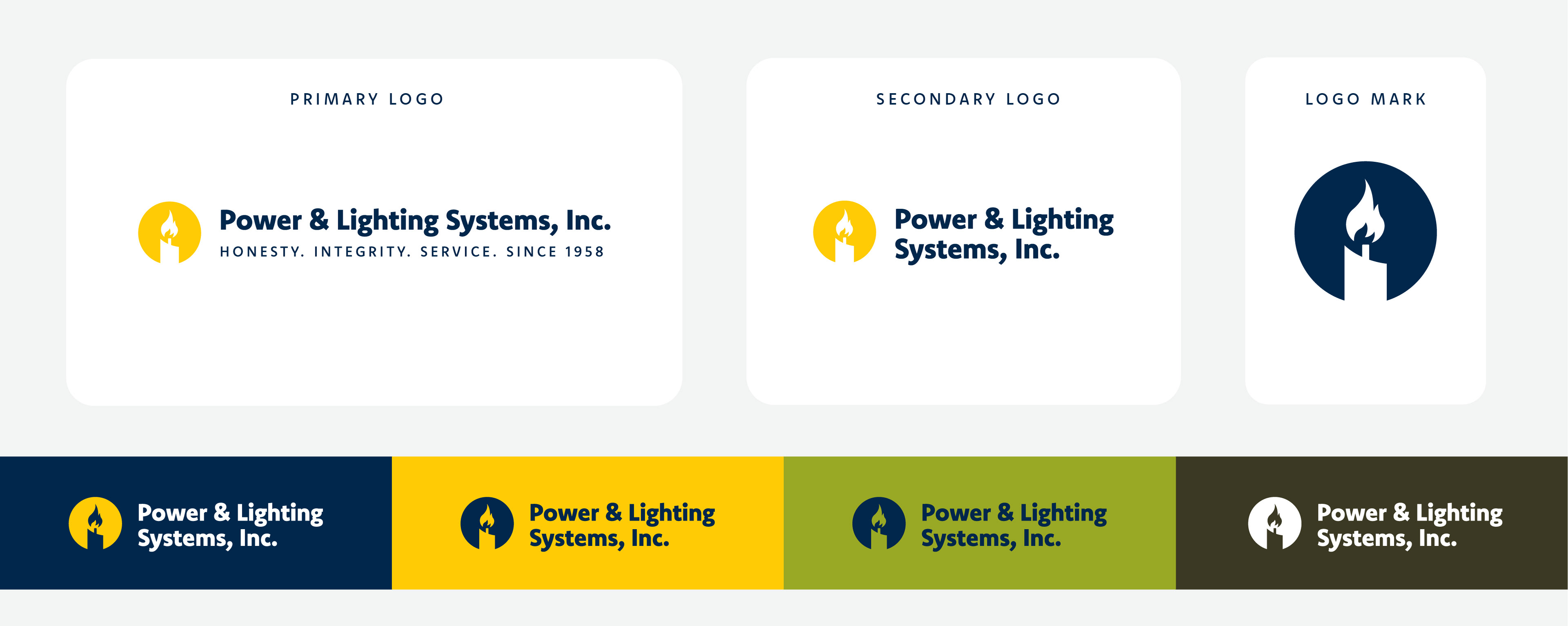
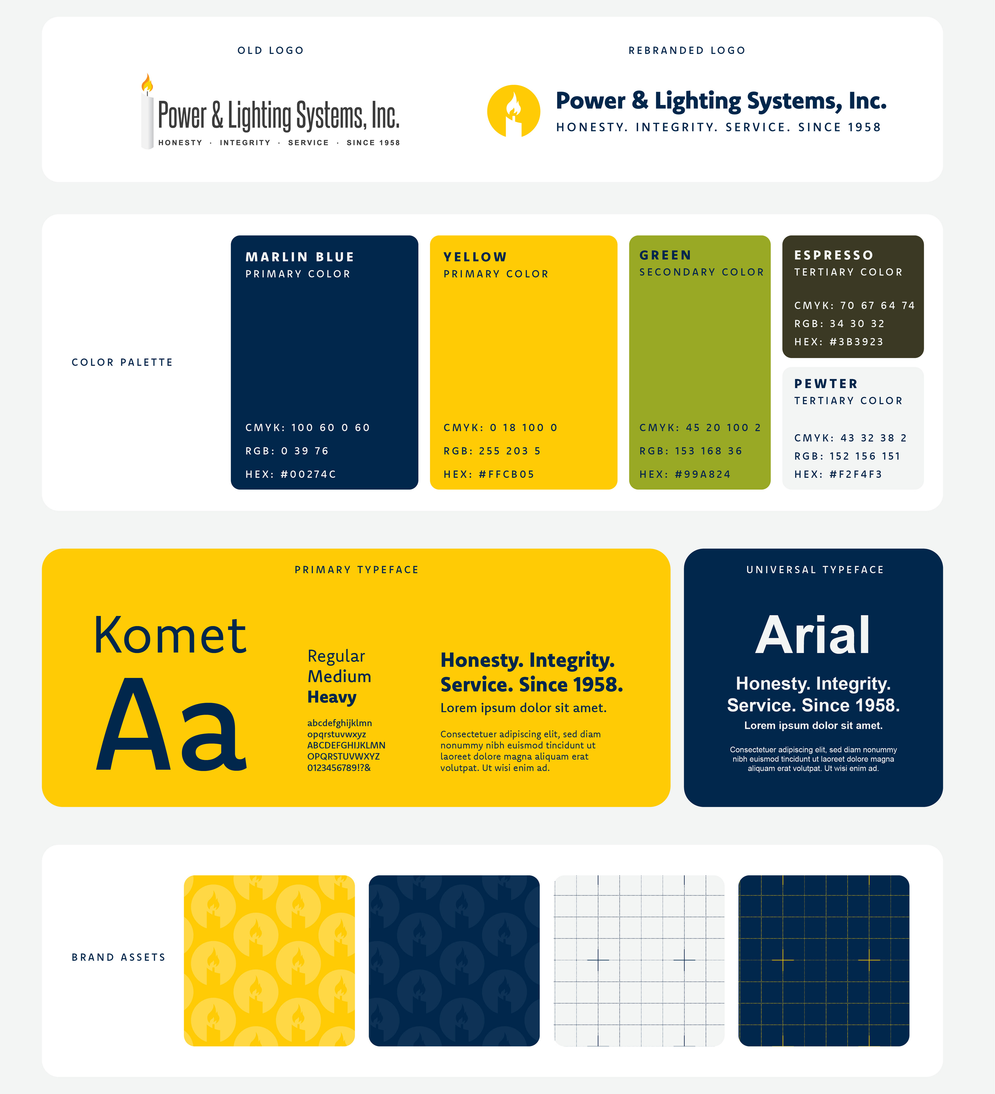
At the core of the redesign is a refined candelabra icon, a direct evolution of the original logo, which referenced the foot-candle, the industry-standard measurement of light intensity.
Rather than eliminate this historical element, it was simplified into a geometric, scalable mark that preserves brand equity while gaining clarity and versatility.
To extend the concept beyond the logo, a modular grid system was introduced throughout the brand. Inspired by photometric layouts and lighting control diagrams, the grid reflects the precision, measurement, and engineering discipline behind professional lighting design.
Execution
Refined legacy symbol into a modern, scalable icon
Developed grid-based layout system rooted in lighting measurement
Established bold blue and yellow primary palette while retaining legacy green
Built typography hierarchy for corporate clarity and authority
Applied identity across signage, events, stationery, and branded materials

Outcome
A cohesive, technically grounded identity that bridges heritage and innovation, visually representing both the science and structure behind lighting design.